Floating Help
During the pandemic, a contextual help solution was developed to address shifting e-commerce behaviors. My role focused on crafting the user experience and interface to reduce friction.
TaQi Store is one of Brazil's largest retail e-commerces, specializing in furniture and home appliances.
With strong regional presence in the South, it blends physical retail with a growing online operation.
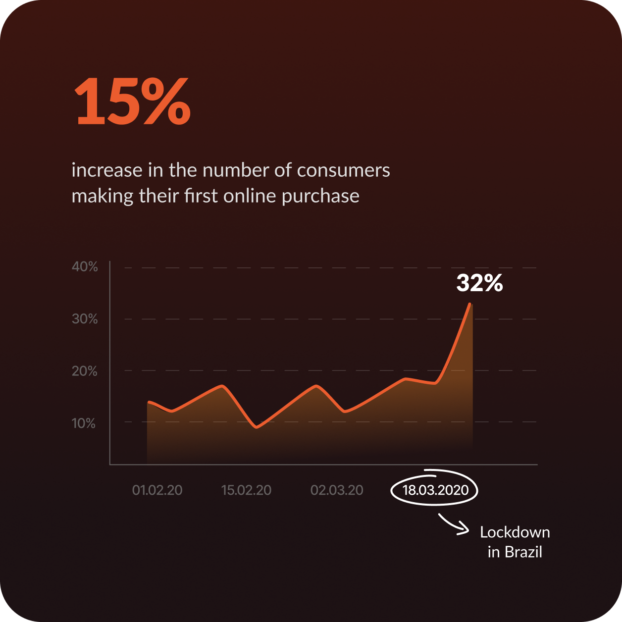
During the pandemic, especially after the lockdown in Brazil, a wave of first-time online shoppers reached TaQi's platform. These users often lacked digital confidence, leading to a spike in support requests.
Many faced doubts and friction during checkout, as they weren't familiar with online buying patterns.
Helping users decide by providing guidance at the right moment
We believed that introducing contextual buying guides and structured FAQs could reduce user uncertainty during the purchase flow. By offering timely, relevant help, we aimed to build confidence in first-time shoppers and increase the overall conversion rate.
Together with the CRO (Conversion Rate Optimization) team, I designed a solution called "Floating Help" — a customizable sidebar featuring key customer questions, giving users quick access to answers and support channels.
It is located on the website's home page, both on mobile and desktop, and follows the user's navigation, facilitating access to their main questions.
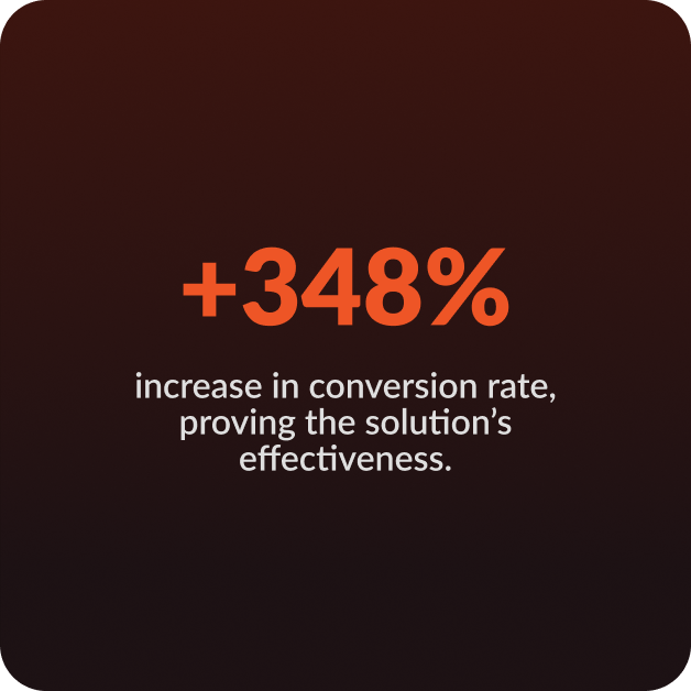
In the first 30 days, the conversion rate jumped from 1.20% to 5.37%, showing the feature's strong impact on reducing friction and helping users complete their purchase journey.
Our team was positively surprised by the results, which strongly validated our hypothesis.
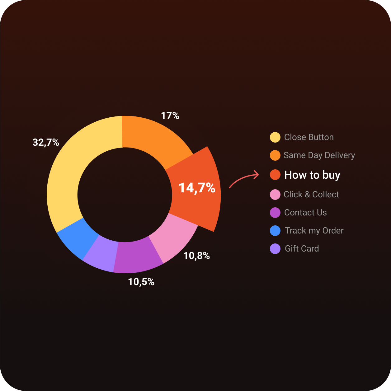
The "How to Buy" item ranked as the third most clicked, showing that easily accessible buying guides effectively address users' basic questions. This helped increase user confidence and contributed to the rise in conversion.
users most often clicked "close," which aligns with typical browsing behavior after checking quick info.
01.Agile innovation
Agility was key in this project — we prioritized speed to market by launching minimum viable prototypes and improving them over time, instead of waiting for a perfect solution.
02.Thinking post-crisis
Customers who had a positive digital experience with TaQi are likely to continue buying after the crisis.
03.Data-informed design
Engagement metrics shaped every iteration — the breakdown revealed which help topics resonated most, allowing us to prioritize content that actually reduced friction.
04.Cross-team collaboration
Working closely with the CRO team was essential — aligning design decisions with conversion goals ensured the solution was both user-friendly and business-effective.
Next Project
Passion Projects →